CI,Package
AD/D
2023/5
2023/5
KOHARU
福島県にある養蜂園のロゴデザイン。
A logo design for a bee farm in Fukushima Prefecture.
The honey collected by Japanese honeybees over the course of a year has a gentle taste like the New Year’s Eve and a beautiful amber color. These characteristics of honey are included in the name “Koharu”.
Or in honey mthe burrow of the branch box. The character of “Koharu” is likened to a honeybee, and the appearance of entering a burrow is symbolized.
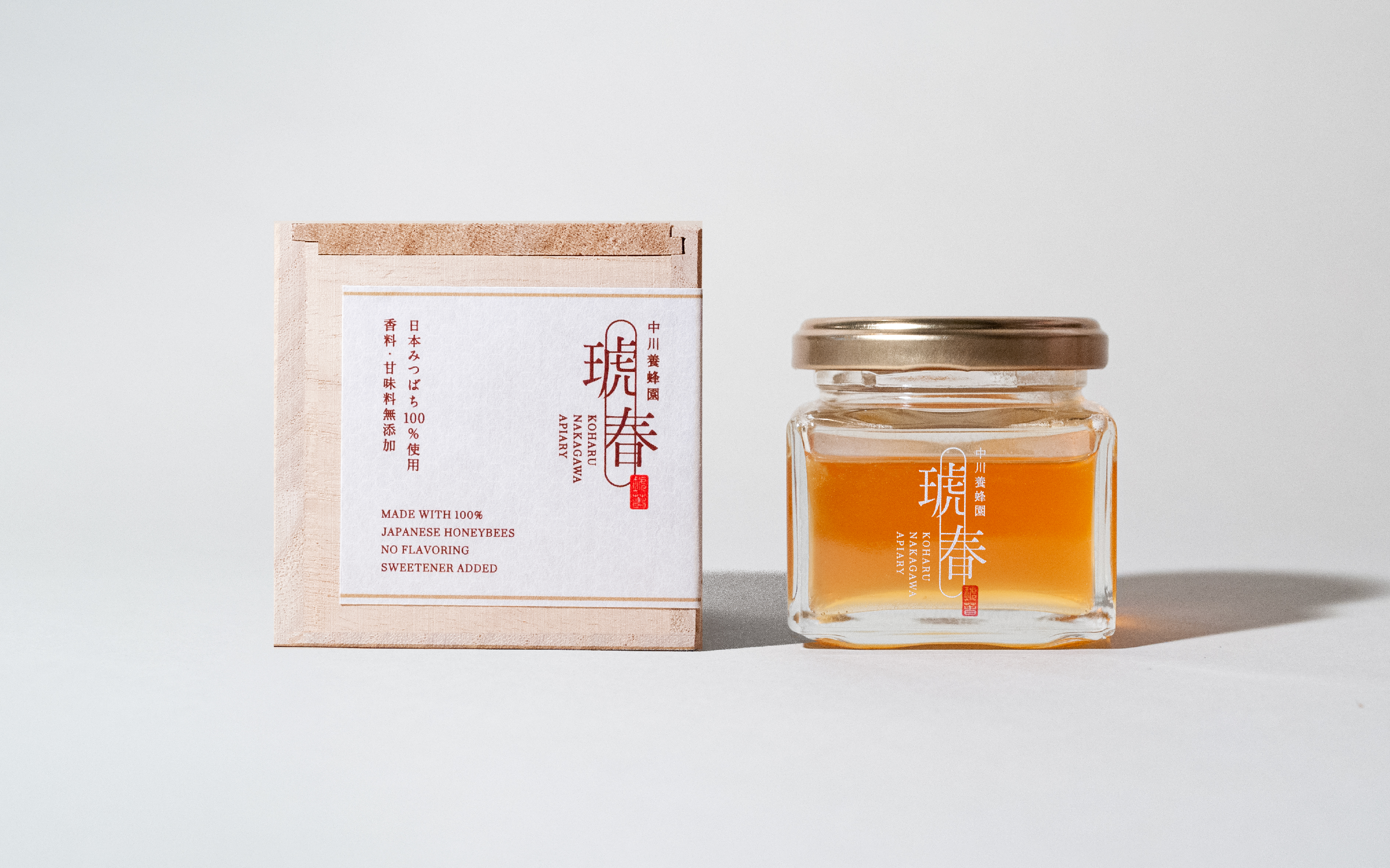
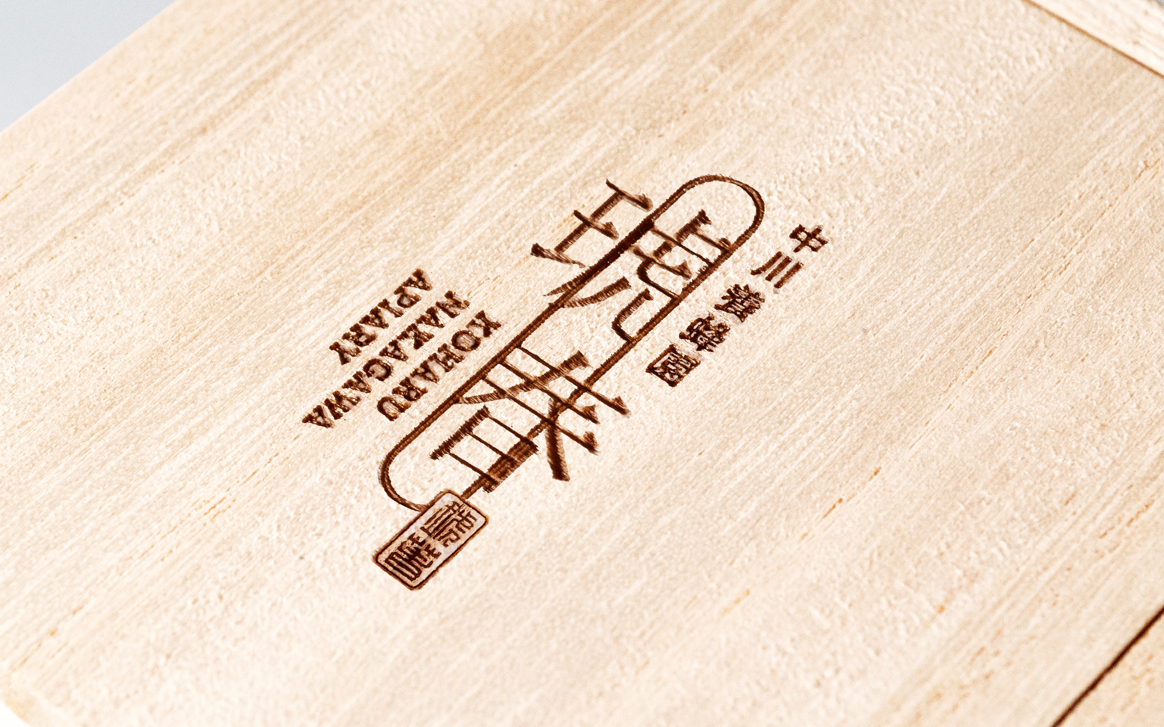
中川養蜂園
福島県にある養蜂園のロゴデザイン。
日本みつばちが1年かけて集めたはちみつは小春日和の様な穏やかな味わいで、綺麗な琥珀色。これらのはちみつの特徴を「琥春」というネーミングに込めました。またはちみつ作りにおいて、分峰箱の巣穴がみつばちが入ってくる重要な要素の一つ。「琥春」の文字をみつばちに見立てて、巣穴に入っていく様子をシンボル化しました。
A logo design for a bee farm in Fukushima Prefecture.
The honey collected by Japanese honeybees over the course of a year has a gentle taste like the New Year’s Eve and a beautiful amber color. These characteristics of honey are included in the name “Koharu”.
Or in honey mthe burrow of the branch box. The character of “Koharu” is likened to a honeybee, and the appearance of entering a burrow is symbolized.